Create Experiences Made to Be Explored
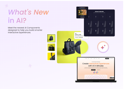
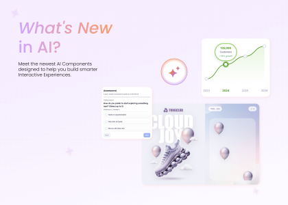
Explore the latest AI Components designed to make content more dynamic, products easier to browse, and decisions more interactive.
These new components make it easier to create experiences that leave a lasting impression if you’re creating a product launch, building a visual portfolio, or designing an interactive campaign.
Here’s what’s new.
Give Your Content More Movement
Static content gets the message across. Interactive content gives people a reason to keep exploring. These AI Components introduce movement, depth, and responsive interactions that make content more engaging without getting in the way of the story.
Stacked Cards with Popup
Give every card more to explore.
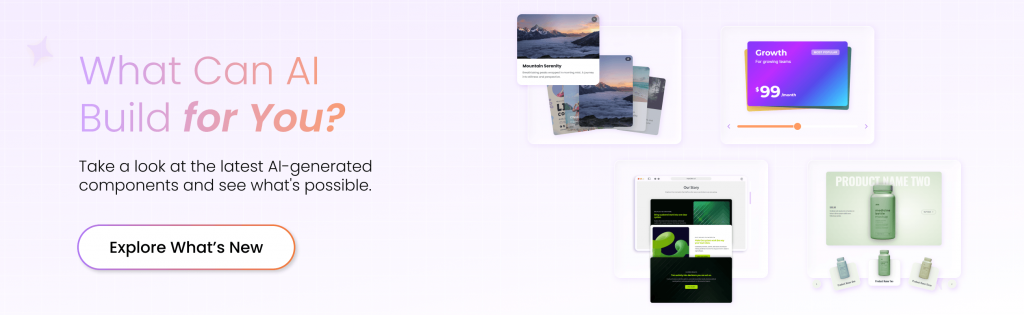
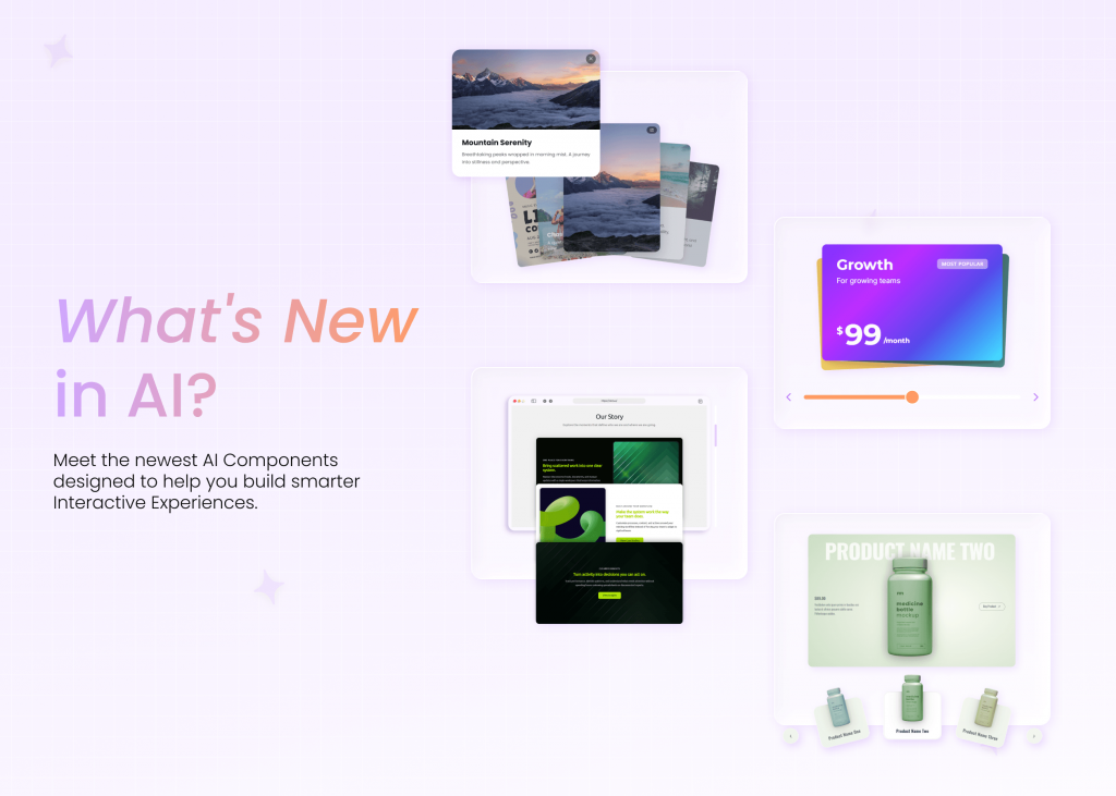
Stacked Cards with Popup presents visual content in an interactive card carousel that visitors can swipe through at their own pace. Each image-based card can open an optional popup with additional details, giving you more room to share information while keeping the main experience clean and easy to browse.
It works especially well when you have several products, stories, or featured items to showcase without putting everything on screen at once.
Great for:
- Product collections
- Customer stories
- Featured content
- Portfolio showcases
- Campaign highlights
Scroll Animation Cards
Make scrolling part of the experience.
Scroll Animation Cards reveals content one card at a time as visitors move down the page. Cards layer over one another to create depth and progression, turning a familiar scrolling action into a more visually engaging way to consume content.
Flexible image layouts, customizable styling, and optional CTA buttons give you plenty of room to adapt the component to your story while guiding visitors toward the next action.
Great for:
- Brand storytelling
- Product benefits
- Step-by-step content
- Campaign narratives
- Feature showcases
Animated Cards
Put your content into motion.
Animated Cards arranges interactive content cards around a central image or text block, creating a radial layout that immediately draws attention to the main idea. Entrance animations, hover effects, and parallax interactions add movement as visitors explore the surrounding content.
Use it when you want to break down a central topic into several related points without relying on a standard grid or list.
Great for:
- Product features
- Service overviews
- Educational content
- Key benefits
- Interactive Presentations
Text Flip Card
Make every card worth a second look.
The Text Flip Card reveals additional content with a smooth 3D flip, giving visitors an easy way to explore more without adding clutter to the page. Keep the front focused on the main message, then use the reverse side for supporting details, explanations, tips, or calls to action.
Custom styling, flexible flip behavior, and automatic flip-back options make it easy to tailor the interaction to different types of content while keeping the experience clean and intuitive.
Great for:
- Product features
- FAQs
- Educational content
- Tips and explanations
- Service highlights
Turn Product Browsing into an Experience
Product exploration shouldn’t feel like flipping through a static catalog. This component creates a more immersive way to browse, compare, and move closer to action.
Interactive Product Carousel
Give every product its moment.
Interactive Product Carousel creates a full-screen browsing experience where each product takes center stage. Visitors can move through products using animated transitions and thumbnail navigation, while dynamic backgrounds help each item feel distinct.
Pricing information and individual CTA buttons can sit alongside each product, giving visitors the details they need without leaving the experience.
Great for:
- Product launches
- Featured collections
- Ecommerce campaigns
- New arrivals
- Product catalogs
Make Pricing Easier to Navigate
Pricing becomes much more useful when visitors can see what fits their needs instead of decoding a static comparison table.
Pricing Slider
Help visitors find the plan that fits.
Pricing Slider lets visitors adjust a metric and instantly see how their selection affects available pricing options. As they interact with the slider, the experience can highlight the best-matching package and display relevant pricing details dynamically.
It’s a more engaging way to communicate plans while helping visitors understand which option aligns with what they’re looking for.
Great for:
- SaaS pricing
- Subscription plans
- Service packages
- Usage-based pricing
- Membership options
Ready to Start Building?
The latest AI Components give you more ways to turn browsing, scrolling, and comparing into active parts of the experience.
Explore the new additions and start experimenting with different ways to present your content, showcase your products, and guide visitors toward the right choice.